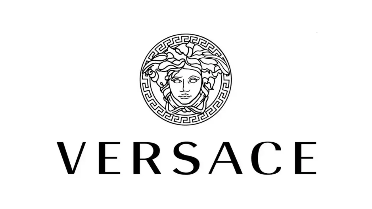
Versace’s logo is a well-known and recognizable emblem in the fashion world, particularly for luxury fashion. It has a very strong impression because of its design, the details of the Medusa head and its association with ancient Greek mythology. Luxury, confidence and style—whether it be on a piece of clothing, handbag, jewelry or accessory, the logo represents it.
The Italian fashion brand was established in 1978 by Gianni Versace, who was known for his innovative designs and ideas. The brand, however, didn’t get its iconic Medusa logo until 1993. Since then, this symbol is a part of the company’s identity.
Table of Contents
The Versace Logo’s Meaning
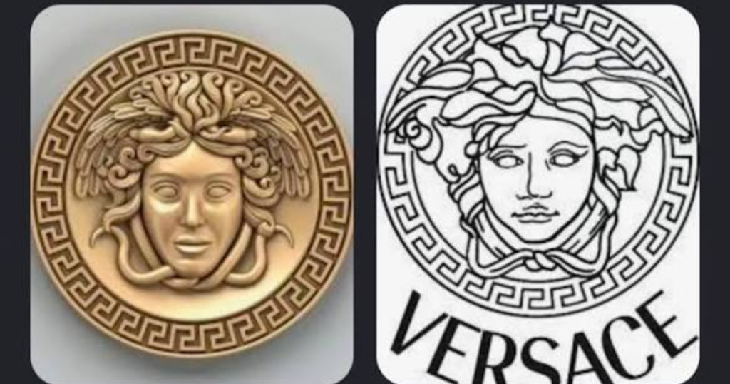
The Versace logo is a representation of the head of Medusa, a mythical figure from Greek mythology. The ancient Greek key pattern (La Greca) is often used in the design of a decorative circular border. The VERSACE brand is shown next to or below the emblem, as shown in the design.
The logo is a mix of old and new, classical art and luxury. Its detailed look is its unique characteristic and its robust lettering makes the brand name easy to recognize.
The Story Behind the Versace Logo
The Versace logo started with the concept of the brand’s founder, Gianni Versace. In 1978 he opened his fashion house in Milan, Italy, and slowly carved out his niche in the international fashion market.
The brand used its name instead of a complicated symbol in the beginning. As business expanded its image was transformed to suit its new role in luxury fashion.
1978–1980: The Brand Begins
Gianni Versace started the company and the company was named after him. This enabled the business to link directly to its creator and his creative vision.
The identity was fairly straightforward in the early years. Rather than using a fancy symbol, company branding was used with text to create recognition.
1980–1990: A Simple Wordmark
In the 1980’s the brand stuck with typography as its defining element of visual identity. The original wordmark featured a simple lettering style in accordance with its era.
Black was still popular and was used to add a good contrast and was effective in various fashion products.
Even though this version didn’t feature the iconic Medusa logo, it would become the first occasion when the name Gianni Versace got its foot in the door of fashion.
For more on the bold, glamorous style of this decade, see our guide to retro 80s style.
1990–1993: A Stronger Visual Identity
The brand became recognized and revised the wordmark with more unique lettering. The design grew more prominent and recognizable, which aided the company to maintain its recognizable appearance.
But the biggest alteration was yet to be effected. Gianni Versace wanted an emblem which could convey the personality of his fashion house, without being completely text-based.
1993: The Medusa Head Arrives
The Medusa head was first used as the central symbol in the brand in 1993 by Gianni Versace. This choice provided the fashion house with a distinctive and memorable image, bringing together fashion and mythology with classical art.
The Medusa logo soon became an integral part of the company’s brand. The detailed design also served the clothing labels, accessories and luxury packaging.
1997–2008: A New Chapter
After Gianni Versace’s death in 1997, the company was left to the leadership of his family. Donatella Versace emerged as a huge creative force while Santo Versace did a significant business job.
The company began to adopt the abbreviated name VERSACE in this time. Although the typography and presentation of the symbol changed over time, the Medusa was never completely forgotten.
2008–Present: A More Flexible Design
The contemporary Versace logo features an elegant Medusa symbol and a well-featured wordmark. The symbol may be above the brand name, beside the brand name or stand alone, depending on the product and application.
Black and gold are still in style. However, the company also adjusts the colors of the logo to different collections and materials.
Why the Versace Logo Stands Out in Luxury Fashion
Luxury fashion brands use different strategies to create recognizable identities. Some focus on initials, while others rely on distinctive lettering or abstract symbols.
Here is a simple comparison of different luxury brand logo styles.
| Fashion Brand | Main Logo Element | Overall Design Style |
| Versace | Medusa head and wordmark | Bold, classical, and decorative |
| Chanel | Interlocking double C | Minimal and elegant |
| Louis Vuitton | Interlocking LV initials | Traditional and recognizable |
| Gucci | Interlocking G design and wordmark | Heritage-inspired and versatile |
| Prada | Wordmark | Clean and understated |
Every brand has a different personality and uses its own brand logo to express it. But Versace has a very unique method of communicating with the letter, he employs a figure from mythology.
Logo-heavy fashion also defined the early 2000s, as seen in our guide to the Ed Hardy set.
How the Versace Logo Appears on Modern Products
The Versace logo is easily recognizable for one reason: its versatility. The company applies the symbol to different categories of products, depending on the size, position and colour of the symbol on the design.
Clothing and Fashion Accessories
The logo can be embroidered as a small detail on clothes or a large printed graphic. Depending on the product, it can be a Medusa head or a combination of the Medusa head and the brand.
For instance, a black T-shirt with a gold emblem looks different than a white shirt with a black wordmark. However, both designs keep the brand’s identity.
Jewelry and Gold Details
Versace’s logo often features gold, serving as a popular choice for jewelry and other high-impact accessories. It comes in a metallic finish which gives an elegant look and enhances the intricate Medusa design.
But for the finish, it is dependent on the product. Some parts are gold colored, and others are silver, or even colored.
Children’s Fashion
Versace also features familiar branding in certain kids fashion lines. They might have logos, colours and decorative elements that will appeal to younger users.
For example, the versace kids necklace logo sweatshirt is a concept that fuses the concept of logo design with sweatshirt design. The exact graphics and information, however, will vary based on the product.
Looking at designer looks for kids? See our Trina Turk boys fashion guide for colorful alternatives.
Understanding the Main Colors of the Versace Logo
The Versace logo isn’t not always in a specific shade. Rather, its presentation is altered based on the product, collection, and visual presentation desired.
Black
Black is one of the most iconic brand colours. Provides contrast and makes the Medusa head stand out from light backgrounds.
Plus, black is suitable for labels, printed graphics, packaging, and web page design.
Gold
The gold color adds to the richness and luxury of the emblem. It is especially suitable for jewellery, accessories and clothing items that are meant to make a statement.
For instance, a gold Medusa head against a black background will be a dramatic contrast.
Gold also works well on clothing, as shown in our metallic jumpsuit guide.
Silver and Other Colors
Selected items may be in silver or other finishes. Some clothing collections also feature colors that match the color of the clothing.
These differences create opportunities to keep the brand icon recognizable, while still not applying the same visual impact to all products.
| Logo Color | Common Visual Effect | Typical Applications |
| Black | Bold and timeless | Clothing, labels, packaging |
| Gold | Luxurious and eye-catching | Jewelry, accessories, statement clothing |
| Silver | Modern and polished | Selected accessories and metallic details |
| Contrasting colors | Creative and expressive | Printed clothing and seasonal collections |
Is the Versace Logo Different Today?
The version of the Versace logo is the same as today, featuring the Medusa head as a central element. While the brand’s typography and layout have evolved over the years the main symbol has stayed closely related to the brand.
The company may use the emblem on top of their wordmark, on the side or standalone. This flexibility allows for various product sizes and marketing materials.
But people might see a difference between logos of the older products and newer collections. These differences may be about the design phase, product category or for the specific use of the brand.
Frequently Asked Questions About the Versace Logo
The Versace logo is a representation of the Medusa head, a mythological creature. It is frequently produced accompanied by the Versace word mark and a decorative key-line border that is reminiscent of the ancient Greek key pattern.
Gianni Versace chose Medusa because of her captivating and unforgettable presence. He wanted people to notice his work, and make a lasting impression on them, like the mythological character.
The Versace fashion house started in 1978. In 1993, though, the iconic Medusa head emblem was added, and it became a major part of the brand’s identity.
Medusa’s head is connected with beauty, strength, allure and iconicness. It embodies the Versace’s pioneering spirit in luxury fashion within the brand.
La Greca (Greek key) is a design that was used in classical Greek art. Usually it is linked with continuity, unity and infinity.
Conclusion
The Versace logo is far from a mere decoration. It is the creative vision of Gianni Versace, the influence of classical mythology and the daring personality of an international Italian fashion house.
So far the logo has changed from the text based identity to the Medusa head in 1993, but it has kept its most well-known feature intact. Its link to beauty, power and classical art renders it a unique position in luxury fashion.